CSS Grid Tutorial: Complete Beginner Guide (2026)
Vikas Sharma
Senior Frontend Developer
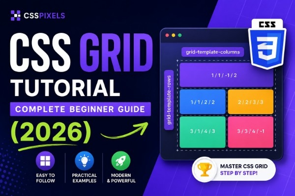
Before Grid, building a multi-column layout meant fighting floats that collapsed on you, or nesting flexbox containers four levels deep because flexbox only works on one axis at a time. Two-dimensional control, rows and columns at once, wasn't something CSS handled without serious workarounds. Grid changed that completely.
What is CSS Grid and what problem does it actually solve?
Think of a newspaper front page. You've got a banner headline spanning all columns, a main story with a photo beside it, smaller stories in the sidebar, and an advertisement spanning the bottom two columns. That's two-dimensional layout: you're controlling placement on both the horizontal and vertical axes at once.
Flexbox handles one dimension well. Give it a row of items and it'll distribute, wrap, and align them. But try to make a second row where columns align with the first, something a newspaper does by default, and you're stuck. Flexbox rows don't know about each other. You end up adding width percentages or calc() hacks to fake column alignment, and the moment your content changes, everything shifts.
Floats were never meant for layout at all. They exist so text can wrap around images. That developers used them as the foundation of page layout for a decade says more about the desperation of the situation than the suitability of the tool.
Grid works differently. You define columns and rows on a parent element. Children slot into those cells automatically. The parent understands both dimensions simultaneously, so a cell in column 2 lines up with column 2 on every row, always, no matter what's in the adjacent cells.
Your first Grid layout in 5 lines of CSS
Here's a three-column card grid, the kind you'd write for a product listing or a blog archive:
.card-grid {
  display: grid;
  grid-template-columns: repeat(3, 1fr);
  gap: 24px;
}
Four lines. Here's what each does:
- display: grid - turns the element into a grid container; every direct child becomes a grid item automatically
- grid-template-columns: repeat(3, 1fr) - creates three equal columns; repeat(3, 1fr) is shorthand for writing 1fr 1fr 1fr
- gap: 24px - puts 24px of space between every cell in both directions
The children need no CSS at all. Drop twelve .card divs inside .card-grid and they'll arrange themselves into four rows of three. That would've taken twenty lines and two media queries with floats.
Understanding grid-template-columns and rows
grid-template-columns is where you'll spend most of your time in a css grid layout. It defines how many columns your grid has and how wide each one is. grid-template-rows does the same vertically, though you'll write it less often, since Grid creates new rows automatically as items overflow.
Here's a reference for the css grid columns values you'll actually use:
| What you write | What it means | Visual result |
|---|---|---|
| 200px 200px 200px | Three fixed 200px columns | Three equal, rigid columns |
| 1fr 1fr 1fr | Three equal fluid columns | Three columns sharing all available space |
| 260px 1fr | Fixed sidebar, fluid main area | Sidebar holds at 260px; main fills the rest |
| repeat(3, minmax(200px, 1fr)) | Three fluid columns, 200px minimum | Columns stretch but won't shrink below 200px |
| repeat(auto-fit, minmax(240px, 1fr)) | As many columns as will fit | Responsive css grid without a single media query |
The fr unit is the one that trips people up first. It gets its own section next.
grid-template-rows uses the same value syntax. Most of the time you'll use auto, rows sizing to their content, or a fixed pixel value for things like a topbar with a specific height.
The fr unit and why it feels like magic
fr stands for fraction of the free space in the grid container. The spec definition isn't wrong, but it doesn't land until you understand what free space actually means.
Picture a 1200px container with grid-template-columns: 300px 1fr 1fr and a 24px gap between columns. Grid first reserves 300px for the fixed column, then subtracts both gaps (48px total). The remaining 852px is the free space. That 852px gets divided equally between the two 1fr columns, each gets 426px. Not 400px. Not 33%. Four hundred and twenty-six.
| Declaration | Container width | Resulting column sizes |
|---|---|---|
| 1fr 1fr | 1200px | 600px, 600px |
| 1fr 2fr | 1200px | 400px, 800px |
| 300px 1fr | 1200px | 300px, ~876px (minus gap) |
| 260px 1fr 1fr | 1200px | 260px, ~446px, ~446px (minus gaps) |
The key insight is fr only distributes what's left after fixed values are subtracted. Once that clicks, mixed layouts like 260px 1fr 1fr become obvious.
Grid gap and the right way to add spacing
I spent an embarrassing amount of time adding margin-right: 24px to grid children and then fighting the extra margin on the last item in each row. gap exists so you never have to do that.
gap adds spacing between grid cells only, not outside the container, not around the edge of the first or last item. Just between cells. You can specify row and column gaps separately:
.card-grid {
  display: grid;
  grid-template-columns: repeat(3, 1fr);
  gap: 32px 24px; /* 32px between rows, 24px between columns */
}
Use row-gap and column-gap individually if you need to override one in a media query. And use gap, not grid-gap. The prefixed version still works, but gap is the standard and applies to Flexbox too.
auto-fit vs auto-fill and the question everyone Googles
Both keywords go inside repeat() and tell Grid to create as many columns as will fit. The difference only shows when the number of items doesn't fill the available space.
When to use which: Use auto-fit when empty tracks should collapse and items stretch to fill the full container width. Best for card grids where items should always fill the row. Use auto-fill when empty tracks stay open and items maintain their size, leaving trailing whitespace. Best when empty slots are meaningful or when you don't want items to stretch beyond their natural size.
| Keyword | 3 items, space for 4 columns | 5 items, space for 4 columns |
|---|---|---|
| auto-fit | 3 columns stretch to fill full width | 4 items on first row, 1 stretched on second |
| auto-fill | 3 filled columns + 1 ghost empty track | 4 items on first row, 1 at minimum size on second |
/* auto-fit: items expand to fill available space */
.product-grid {
  display: grid;
  grid-template-columns: repeat(auto-fit, minmax(240px, 1fr));
  gap: 24px;
}

/* auto-fill: items keep their size, empty space stays empty */
.card-shelf {
  display: grid;
  grid-template-columns: repeat(auto-fill, minmax(240px, 1fr));
  gap: 24px;
}
When in doubt, auto-fit is what you want. The stretching behavior is almost always more polished than trailing whitespace on a half-empty row.
grid-template-areas and making your layout self-documenting
Named template areas are one of Grid's most underrated features. Here's a full dashboard layout:
.dashboard {
  display: grid;
  grid-template-columns: 260px 1fr 300px;
  grid-template-rows: 64px 1fr auto;
  grid-template-areas:
    "header  header  header"
    "sidebar main    aside"
    "footer  footer  footer";
  min-height: 100vh;
}

.dashboard-header  { grid-area: header; }
.dashboard-sidebar { grid-area: sidebar; }
.dashboard-main    { grid-area: main; }
.dashboard-aside   { grid-area: aside; }
.dashboard-footer  { grid-area: footer; }
Read those quoted strings. They're a literal ASCII map of your layout. The header fills all three columns. Sidebar, main content, and aside share the middle row. Footer spans the full width again.
The layout logic lives entirely in CSS, not markup. Move the sidebar to the right on desktop by rewriting the area strings, the HTML doesn't change. On mobile, collapse to a single column and redefine the areas. I wasted two days restructuring nested divs before I understood this pattern; now it's the first thing I reach for on any page-level layout.
5 css grid layouts you'll actually build
1. Responsive card grid
Use case: product listings, blog archives, team member pages.
.card-grid {
  display: grid;
  grid-template-columns: repeat(auto-fit, minmax(280px, 1fr));
  gap: 24px;
}
Insight: one declaration replaces three breakpoints. Cards are always at least 280px wide and fill the row completely.
2. Classic sidebar layout
Use case: documentation sites, admin panels, content editors.
.sidebar-layout {
  display: grid;
  grid-template-columns: 260px 1fr;
  min-height: 100vh;
}
Insight: switching to a single-column stacked layout on mobile is grid-template-columns: 1fr inside a media query. Nothing else changes.
3. Full-page dashboard
Use case: analytics tools, CMS backends, SaaS app shells.
.app-shell {
  display: grid;
  grid-template-columns: 240px 1fr;
  grid-template-rows: 60px 1fr;
  grid-template-areas:
    "nav    topbar"
    "nav    content";
  height: 100vh;
}

.app-nav     { grid-area: nav; overflow-y: auto; }
.app-topbar  { grid-area: topbar; }
.app-content { grid-area: content; overflow-y: auto; }
Insight: the nav spans both rows, so it scrolls independently of the content area. No JavaScript. No position: fixed gymnastics.
4. Responsive image gallery
Use case: photo portfolios, product images, media libraries.
.image-gallery {
  display: grid;
  grid-template-columns: repeat(auto-fill, minmax(200px, 1fr));
  grid-auto-rows: 200px;
  gap: 8px;
}

.image-gallery img {
  width: 100%;
  height: 100%;
  object-fit: cover;
}
Insight: grid-auto-rows: 200px sets a fixed height for every implicitly created row, keeping images square without any aspect-ratio wrapper hacks.
5. Holy grail layout
Use case: editorial sites, marketing pages, content-heavy templates.
.holy-grail {
  display: grid;
  grid-template-columns: 180px 1fr 180px;
  grid-template-rows: auto 1fr auto;
  grid-template-areas:
    "header  header  header"
    "left    main    right"
    "footer  footer  footer";
  min-height: 100vh;
}

.holy-grail-header { grid-area: header; }
.holy-grail-left   { grid-area: left; }
.holy-grail-main   { grid-area: main; }
.holy-grail-right  { grid-area: right; }
.holy-grail-footer { grid-area: footer; }
Insight: this layout required six float hacks and a clearfix in 2010. Nine lines of CSS.
Common mistakes and the fixes
Margins instead of gap
/* Wrong */
.card-grid .card {
  margin: 12px;
}

/* Right */
.card-grid {
  gap: 24px;
}
Margins stack between adjacent items, creating 24px gaps between cards but also 12px around the grid edges, which almost never matches your design intent.
Forgetting fr distributes leftover space
/* Wrong assumption */
.layout {
  grid-template-columns: 300px 1fr 1fr;
}
/* These 1fr columns are NOT each one-third of the container width */

/* What is actually happening */
/* 300px plus gaps are subtracted first; the two 1fr columns split what remains */
If you want the fr columns to behave like thirds, use 1fr 1fr 1fr. The moment you mix fixed values with fr, the math changes.
Nesting grids unnecessarily
/* Wrong */
.card-wrapper {
  display: grid;
  grid-template-columns: 1fr; /* a grid with one column is just a block */
}

/* Right */
.card {
  display: flex;
  flex-direction: column;
  padding: 24px;
}
A single-column grid does nothing a block element doesn't already do. Nested grids have real uses, but a grid with exactly one column is almost always accidental.
Ignoring source order for accessibility
/* Risky: visual order does not match DOM order */
.blog-layout .sidebar { grid-column: 1; }
.blog-layout .article { grid-column: 2; }
/* But in HTML, article comes before sidebar */
Grid places elements visually in any order you declare. Screen readers and keyboard navigation follow DOM order, not visual order. If the two diverge, test with the Tab key, focus should move in a logical reading sequence. When it doesn't, fix the source order first.
When Grid isn't the right tool
Reach for Flexbox when you're laying out content in a single direction, a navigation bar, a row of tags, items stacking inside a card. Flexbox sizes items based on their content, which is exactly what you want when items have naturally different widths. Grid is the right call when you know the structure of the layout before you know the content, when you're thinking in columns and rows rather than a sequence of boxes. If you find yourself writing a grid with one row and no plans to add more, you want display: flex. When rows and columns need to stay in sync across both axes, that's Grid.
For a full breakdown of when each wins, see our CSS Grid vs Flexbox comparison at /blog/css-grid-vs-flexbox
Build it visually
If you want to see these properties update in real time before committing to code, the CSS Grid Generator lets you do exactly that. Adjust columns, rows, gaps, and template areas visually, then copy the output directly into your project.
Table of Contents
Share Article
Vikas Sharma
Senior Frontend Developer
Senior Frontend Developer with 8+ years of experience building production CSS layouts.