CSS Grid vs Flexbox: Which Should You Use? (2026)
Vikas Sharma
Senior Frontend Developer
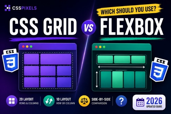
Everyone has asked this question, and the confusion is fair. You'll hear Grid and Flexbox described as alternatives when they're actually different tools built for different jobs. Here's the one-line mental model: Grid is two-dimensional, Flexbox is one-dimensional. But that framing only gets you halfway there.
The mental model that actually helps
The 1D vs 2D framing is accurate but incomplete. The more useful model is this: Flexbox is content-driven, Grid is layout-driven.
With Flexbox, you drop items into a container and it adapts to them. Items shrink or grow based on their content. The layout reacts to what's inside. That's perfect for a navigation bar where the links determine the spacing, or a button where an icon and label sit side by side.
With Grid, you define the structure first. Here are the columns, here are the rows, now content fills those slots. The layout doesn't care how much text is in a card. It cares about the grid you defined. That's why Grid is the right tool for page structures and card layouts where visual consistency matters more than content flexibility.
Think of a bookshelf versus a spreadsheet. Flexbox is the bookshelf: books sit side by side and the shelf adjusts to whatever you put on it. Grid is the spreadsheet: you define the cells first, then populate them.
What CSS Grid is genuinely best at
Page and section structure
The moment you're laying out a full page, header, sidebar, main content, footer, Grid is the right call. You're defining zones. Named areas make it readable and easy to change.
.page-layout {
  display: grid;
  grid-template-columns: 260px 1fr;
  grid-template-rows: 64px 1fr auto;
  grid-template-areas:
    "header  header"
    "sidebar main"
    "footer  footer";
  min-height: 100vh;
}
Try doing this with Flexbox. You can't, not without nesting containers three levels deep and losing all the structural clarity.
Equal-height cards regardless of content
This one wins arguments. You have a three-column card grid. Some cards have two lines of text, some have five. With Flexbox wrapping, cards in different rows don't line up. With Grid, they do. Always.
.card-grid {
  display: grid;
  grid-template-columns: repeat(3, 1fr);
  gap: 24px;
}
Every card in the same row is the same height because Grid rows are consistent. The layout drives the content, not the other way around.
Responsive layouts without media queries
auto-fit with minmax() gives you a responsive css grid layout from a single declaration. No breakpoints. Four columns on a wide screen, two on a tablet, one on mobile.
.article-grid {
  display: grid;
  grid-template-columns: repeat(auto-fit, minmax(300px, 1fr));
  gap: 32px;
}
Complex multi-zone dashboards
Named template areas let you define a dashboard structure that reads like a diagram. Come back to this CSS six months later and you'll know exactly what the page looks like.
.dashboard {
  display: grid;
  grid-template-columns: 240px 1fr 320px;
  grid-template-areas:
    "nav     topbar  topbar"
    "nav     main    panel"
    "nav     footer  footer";
}
What Flexbox is genuinely best at
Navigation bars
A nav bar is one-dimensional. Logo on the left, links on the right. Flexbox handles this in three lines.
.nav-bar {
  display: flex;
  align-items: center;
  justify-content: space-between;
  padding: 0 24px;
  height: 64px;
}
You could use Grid here, but you'd be fighting the tool. Flexbox handles the content-driven sizing of nav items naturally.
Aligning icon with text
Every icon-next-to-label situation, a button, a menu item, a list item, that's Flexbox territory. It's built exactly for this.
.icon-button {
  display: flex;
  align-items: center;
  gap: 8px;
}
Centering a single element
The classic problem. What used to take four lines of absolute positioning is now two.
.hero-section {
  display: flex;
  align-items: center;
  justify-content: center;
  min-height: 100vh;
}
Pinning a card footer to the bottom
Card body varies in length, footer should always sit at the bottom. Flexbox with margin-top: auto solves this cleanly and reliably.
.blog-card {
  display: flex;
  flex-direction: column;
  height: 100%;
}

.blog-card__body {
  flex: 1;
}

.blog-card__footer {
  margin-top: auto;
}
Grid can technically do this too, but Flexbox is the right tool. The card is a one-dimensional stack and the footer needs to push to the end.
The css grid vs flexbox comparison: 8 real scenarios
| Scenario | Winner | Why |
|---|---|---|
| Page-level layout (header, sidebar, main, footer) | Grid | You're defining two-dimensional zones, not a sequence of items |
| Navigation bar with logo left and links right | Flexbox | One-dimensional, content-driven spacing |
| Card grid where all cards must be equal height | Grid | Grid rows enforce consistent heights across each row |
| Centering one element inside another | Flexbox | Two lines: align-items and justify-content |
| Responsive layout without media queries | Grid | auto-fit + minmax does what Flexbox wrapping cannot |
| Aligning icon with text in a button | Flexbox | Classic one-dimensional alignment task |
| Dashboard with named regions | Grid | Template areas are purpose-built for this |
| Footer with consistent-width columns | Grid | Columns stay consistent regardless of content length |
Using them together, the pattern that actually works
Here's what most tutorials miss: Grid and Flexbox are not in competition. The best CSS layout pattern uses both.
Grid handles the macro structure: the page skeleton, section zones, card grids. Flexbox handles the micro layout, what happens inside each component. One controls the big picture, the other handles the details.
Here's a complete blog card showing both at work:
/* Grid controls the card grid layout */
.blog-card-grid {
  display: grid;
  grid-template-columns: repeat(auto-fit, minmax(320px, 1fr));
  gap: 32px;
}

/* Flexbox controls the card's internal layout */
.blog-card {
  display: flex;
  flex-direction: column;
  border-radius: 12px;
  overflow: hidden;
  border: 1px solid #e5e7eb;
}

.blog-card__image {
  aspect-ratio: 16/9;
  object-fit: cover;
  width: 100%;
}

.blog-card__body {
  display: flex;
  flex-direction: column;
  flex: 1;
  padding: 24px;
}

.blog-card__excerpt {
  color: #6b7280;
  flex: 1;
}

.blog-card__footer {
  margin-top: 16px;
  display: flex;
  align-items: center;
  justify-content: space-between;
}
Grid keeps all the cards the same height across a row. Inside each card, Flexbox pushes the footer to the bottom regardless of content length. Neither tool could do both jobs alone.
The 30-second decision rule
When you need to make the call quickly, run through this:
- Laying things out in one direction and item size depends on content? Use Flexbox.
- Defining a structure first, with rows and columns that exist independently of what fills them? Use Grid.
- Need consistent column alignment across multiple rows? Use Grid.
- Building a component that lives inside a larger layout, like the inside of a card or a form row? Use Flexbox.
When in doubt: if you're thinking about the relationship between items flowing in one direction, it's probably Flexbox. If you're thinking about how things sit in two dimensions at once, it's Grid.
One thing each does badly
Grid handles most layout problems cleanly, but intrinsic sizing gets messy when column widths need to respond to content. If you need columns to shrink to fit their content the way table cells do, Grid can behave unexpectedly. The min-content and max-content keywords exist for this, but they're not always intuitive to reason about. Grid also gets verbose when you start spanning items across non-obvious positions; tracking grid-column: 2 / 4 manually across a complex eight-column layout is error-prone.
Flexbox's real weakness is consistent column widths across rows. Put three flex items on the first row and two on the second and those two items won't align with the row above. Flexbox has no concept of cross-row column alignment. No amount of clever flex-basis settings will give you what a single grid-template-columns declaration does. When column consistency across multiple rows matters, stop reaching for Flexbox.
Build both visually
If a visual helps, both tools run in your browser with no sign-up required. Adjust the properties and copy the CSS when you're done.
Table of Contents
Share Article
Vikas Sharma
Senior Frontend Developer
Senior Frontend Developer with 8+ years of experience building production CSS layouts.